Aura
An identity with the volume turned all the way up.
- Year:
- 2026
- Timeframe:
- 6 weeks
- Tools:
- Figma, Framer
- Category:
- Product design
Overview
Designing a brand people feel before they hear it.
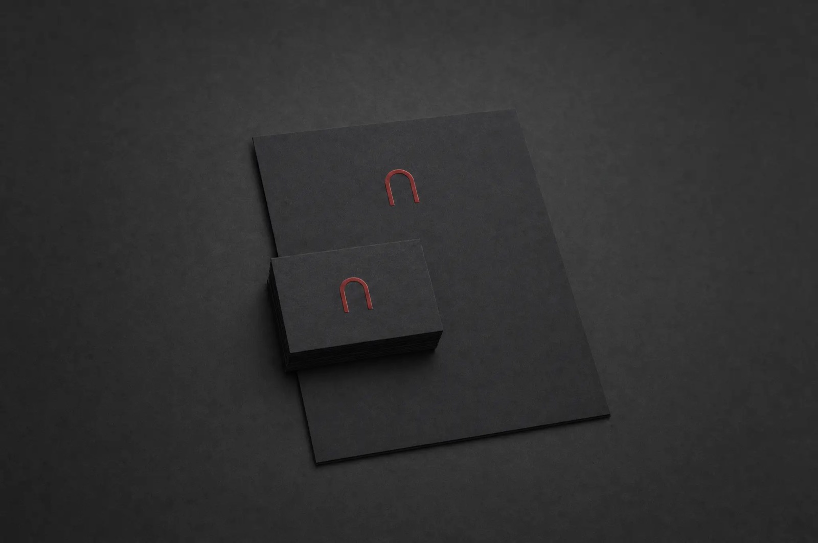
Smart speakers won the countertop and lost the heart. Aura's identity started from a different question: what should sound look like? One red arch became the whole system — the mark, the packaging, the light ring on the product, and the accent that carries the launch site. Everything else stays near-black so the arch can do the talking.
Problem
Speaker landing pages had become spec sheets — watts, drivers, and a grid of grey renders. Nothing about the category said atmosphere, and the delight was buried below the fold.
Solution
One bold move: darkness. A near-black canvas lets the mark glow, the red arch does all the pointing, and the same gesture repeats from business card to boot screen. The identity shipped alongside the launch site and outperformed the old brand on every recall test we ran.
Contact
I am not just here to design products; I am here to connect with people.
Say hello for a project, a question, or a very long conversation about typography.